 OrchardHQ
What questions you can ask at the desk.
Analytics live at the desk — capture happens in the field (see Plan, Observe, Diagnose). This guide is what comes out.
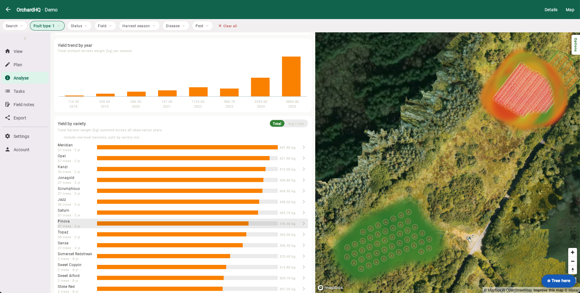
The analytics tab pulls every observation, action and task into a small set of views — each one answers a question you'd otherwise chase in a spreadsheet.
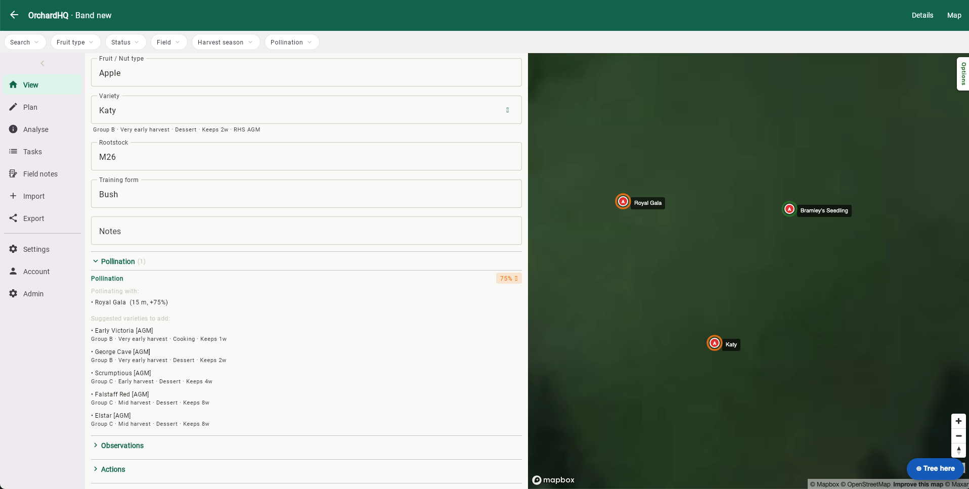
Are my trees pollinating each other?
Available on every tier — pollination is the heart of choosing a partner variety, free users included.
Same scoring engine in the live orchard and the planner. For each tree, find every other tree of the same fruit type, a different variety, with overlapping flowering, within effective distance — 80 m for insect-pollinated pome and stone fruit (exponential decay halving at 40 m), 15 m for wind-pollinated cobnut, 100 m for walnut. Cobnut gets a wild-hazel flag — if there's wild hazel in range, the score reflects it.
Where is yield coming from?
Yield heatmap drops a coloured dot on every tree weighted by latest harvest weight (or by year, with the v2 flag on). Yield trend rolls up to the orchard — total kg per year, mean per tree, contributing tree count.
Which variety, which block?
Total kg per variety, average per tree, year count, tree count. Same shape rolled up to management units so you can compare the north paddock against the south. Filter sidebar limits by fruit type, status, harvest season or unit.
Where is disease pressure building?
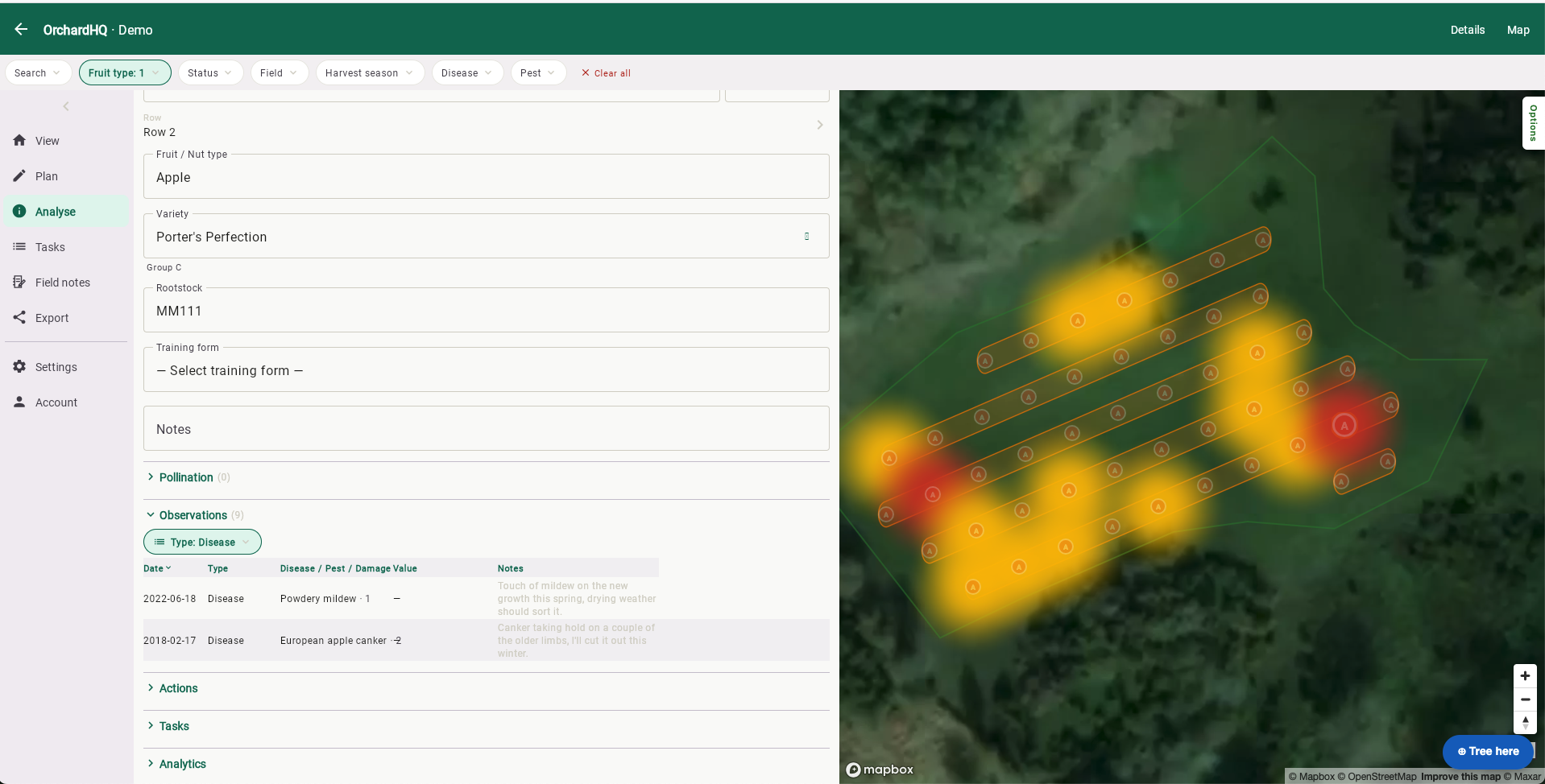
Disease pressure tabulates incidence by year, disease and severity. Disease heatmap maps it spatially for the selected disease and year range.
Are the varieties flowering in sync?
Calendar-style Gantt of expected and observed flowering and harvest, one row per variety, twelve-month grid. Expected windows come from the variety reference; observed dots come from your observations.
Why is one tree underperforming?
One tree's analytics card: yield over time, peer-comparison against the same variety in the same orchard, and a disease summary. Useful when one tree is consistently below the row average.
Roadmap
Analyse is built around the questions a grower actually asks at the end of a season: which rows produced, which varieties travelled well, which trees got hit hardest by what.
We're working on:
- Predictive analytics — what will the yield be, and what do we need to protect.
- More dimensions to query — soil data, weather data.
- The effectiveness of management regimes — mulching, feeding, and the like.
From the orchard
A guide explains; a walkthrough shows. Posts from Frank's own orchard in Gort:
More walkthroughs coming as the orchard goes in this winter — including yield and pollination analytics once we have a season's data to look back on.
Don't see what you need? hello@orchardhq.app — we'd like to hear about it.
See the analytics running on the demo orchard.
Try the demo → Request access →